The Most-Read Page You Never Designed: Auditing the Billing Statement
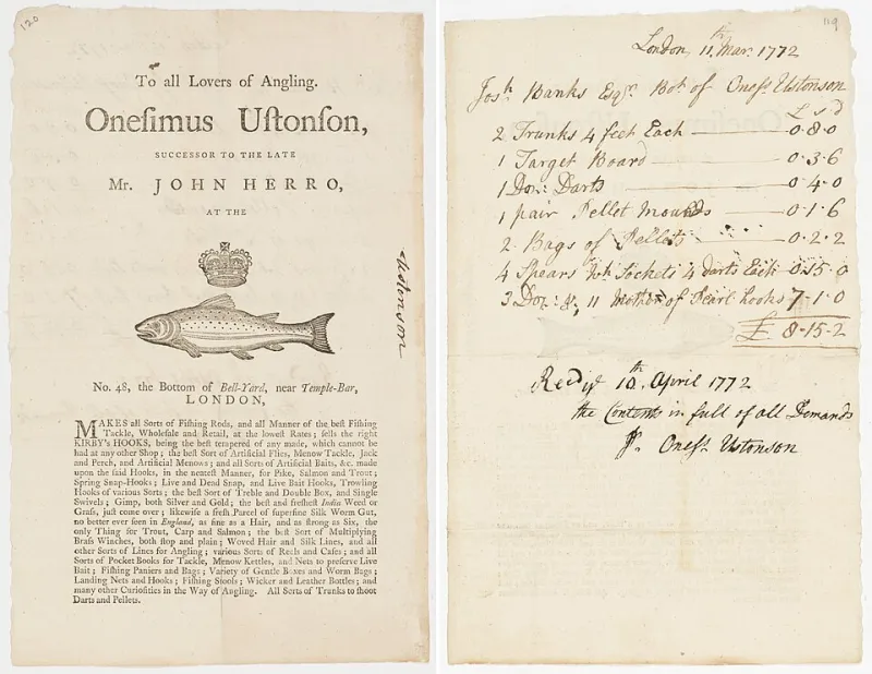
Photo: Onesimus Ustonson, Public domain, via Wikimedia Commons
There is a document leaving your organization every month that carries your logotype, your typeface, your color, and your name — and almost certainly no designer has touched it since the accounting software was configured.
The invoice is the most reliably read page a professional-services firm produces. Homepages are skimmed. Brochures are discarded. A statement addressed to a named client, with a number attached and a due date on it, is opened within hours and frequently forwarded to a second and third reader. It is the one piece of brand communication with guaranteed attention, and it is usually the least designed.
Hierarchy Is a Form of Respect
Every billing statement answers four questions: who is asking, what is being charged, how much, and by when. Design maturity is measured by how quickly a reader can find those four answers without reading anything else.
In most firms, the reader cannot. The total sits in the same typographic weight as a line-item description. The due date is buried in a paragraph of terms. The remittance instructions appear in a font size chosen by a developer in 2011 and never revisited. The result is not merely unattractive — it is a small act of friction repeated hundreds of times a month, at the exact moment a client is deciding how promptly to pay.
A single typographic gesture resolves most of it: one clear level for the amount due, a second for the client and period, a third for the line items, and a muted fourth for the terms. Four levels. No exceptions, no gradients, no shadows.
What Typography Says About Competence
A statement set in a default sans-serif, with three competing alignments and numbers that do not line up, communicates something specific: nobody is minding the details. Clients do not articulate this. They simply form an impression that the engagement is administered rather than managed.
Set the document in the brand's actual typefaces, or in a well-chosen neutral if licensing prevents it. Align currency figures to the decimal. Use tabular numerals so columns read vertically. Give labels and values a consistent rhythm so the eye can travel down the page instead of across it. None of this is ornament; each decision removes a moment of hesitation.
The same applies to color. A restrained accent used once — for the amount due, and nowhere else — will outperform a branded header bar every time. Restraint reads as confidence. A statement that shouts its identity from four different areas reads as anxiety.
Plain Language Lowers the Support Queue
The copy on an invoice is written for the person paying it, not for the person who built the billing system. Yet most statements carry internal language: fee codes, engagement references, and abbreviations that mean nothing outside the finance department.
Rewrite the labels first. Replace an internal code with a short description a client would recognize. Put the payment terms in one sentence above the total rather than in a block of conditions below it. If a charge requires explanation, add a single line beneath it rather than expecting a phone call.
Then examine the payment path. A statement that lists four payment methods with no indication of which one the firm prefers creates a decision where there should be none. State the default, name the alternatives, and include a remittance reference that matches what the client's own accounts-payable system expects. Every ambiguity here becomes an inbound email.
What Chaos Looks Like
An audit of an undisciplined statement usually surfaces the same symptoms:
- Three or more typefaces, one of which is a system fallback that should never have shipped.
- Currency figures set in a proportional font, so columns do not align.
- The total indistinguishable from the subtotal at a glance.
- A logo supplied as a low-resolution raster and stretched.
- Terms and conditions in a size that fails accessibility guidance.
- A second page that reformats the header entirely, as though produced by another company.
- Contact details that route to a general inbox rather than a named person.
None of these are criminal. Together they describe a firm that has never asked what its paperwork says.
A Before-and-After Audit
Start with a single sample statement for a real client, redacted. Read it on a phone, since a growing share of recipients open the attachment there. Time how long it takes to locate the total, the due date, and a way to pay. If any of the three takes more than five seconds, the hierarchy is failing.
Then rebuild in this order: grid, typographic levels, number formatting, labels in plain language, payment instructions, and finally brand expression. Most of the improvement arrives before the last step. Only when the document is legible and calm should it carry a color, a rule, or a mark.
Finally, test it against a second document in the same family — a receipt, a reminder notice, a credit memo. Consistency across the set is the actual signal of maturity. One polished invoice beside a chaotic reminder email tells the client which one reflects the real organization.
The Cost Objection, Answered
Firms resist this work because it looks like a design expense attached to a document nobody compliments. The argument is better framed the other way: it is the cheapest client-experience project available. It requires no new software in most cases, no campaign budget, and no channel strategy — only a template revision, a style definition in the billing tool, and a willingness to edit the labels.
SuperShine Studio's view is that visual identity is proven in administrative artifacts rather than in presentations. A pitch deck can be art-directed for a week. A statement has to be produced three hundred times a year, by staff who are not designers, without drifting.
That is the real test of a brand system. Not whether it shines in the room, but whether it holds its shape on page two of a billing PDF sent on a Tuesday afternoon.